
As always, I’m happy to be here with you today on Unexpected Elegance – I always look forward to my monthly visits!
Paint colors can be a stressful thing. It’s SO hard to know what the color will actually look like on your walls from that tiny little swatch you pick up at the hardware store…

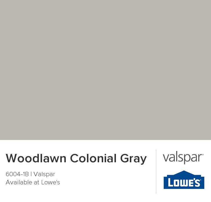
When we moved into our home last fall, I decided to keep the walls in our main living areas neutral. Rather then test out new paint colors, I just used what we had in our previous home: Valspar’s Cincinnatian Hotel Briggs Beige and Valspar’s Woodlawn Colonial Gray.

Here’s the deal. I love warm the warm undertones of the beige, but I also wanted some gray into my home. So, I use both a beige and a gray.
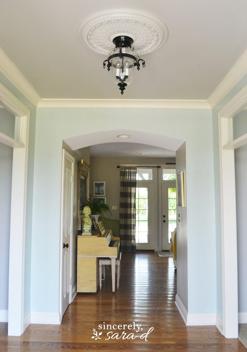
When you first walk into my home, you walk into the hallway and the office (painted in Woodlawn Colonial Gray) and the dining room (also painted in Woodlawn Colonial Gray) greet you on either side. I’m type A personality and if you follow me, you know I LOVE and NEED symmetry. So, I had to have equal color on either side for balance. However, I decorated the rooms with completely different color schemes although they both share the same common wall color. The office is fun and cheerful while the dining room is more sophisticated and subdued:
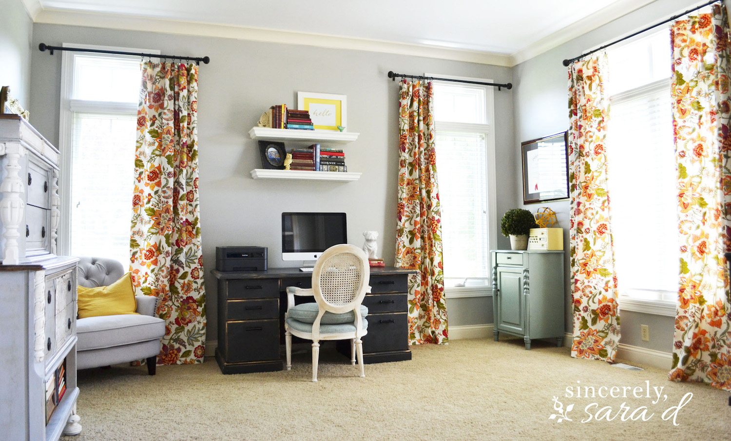
To see more about my office, you can click HERE.
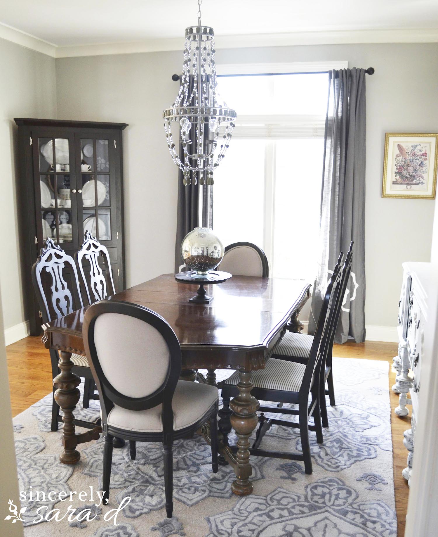
Click HERE to see more on my dining room and HERE to see how I created faux wallpaper on one wall.
I used the beige colors in the back of my house – in the family room and kitchen. The two rooms connect, so I went ahead and used the same color throughout the space.
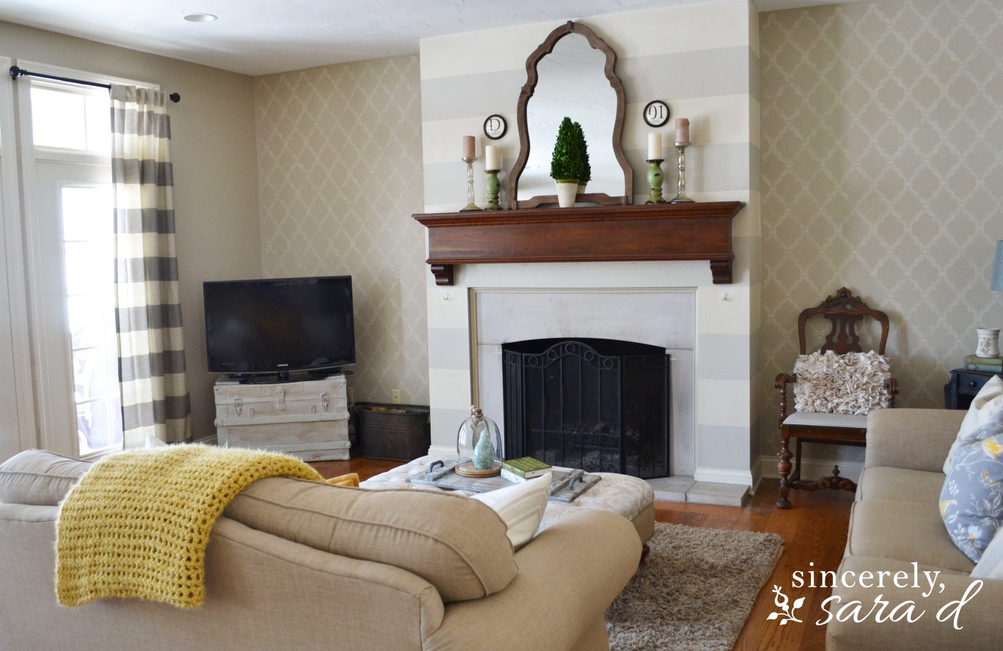
You can see more about my living room and the striped wall and stenciled wall HERE.
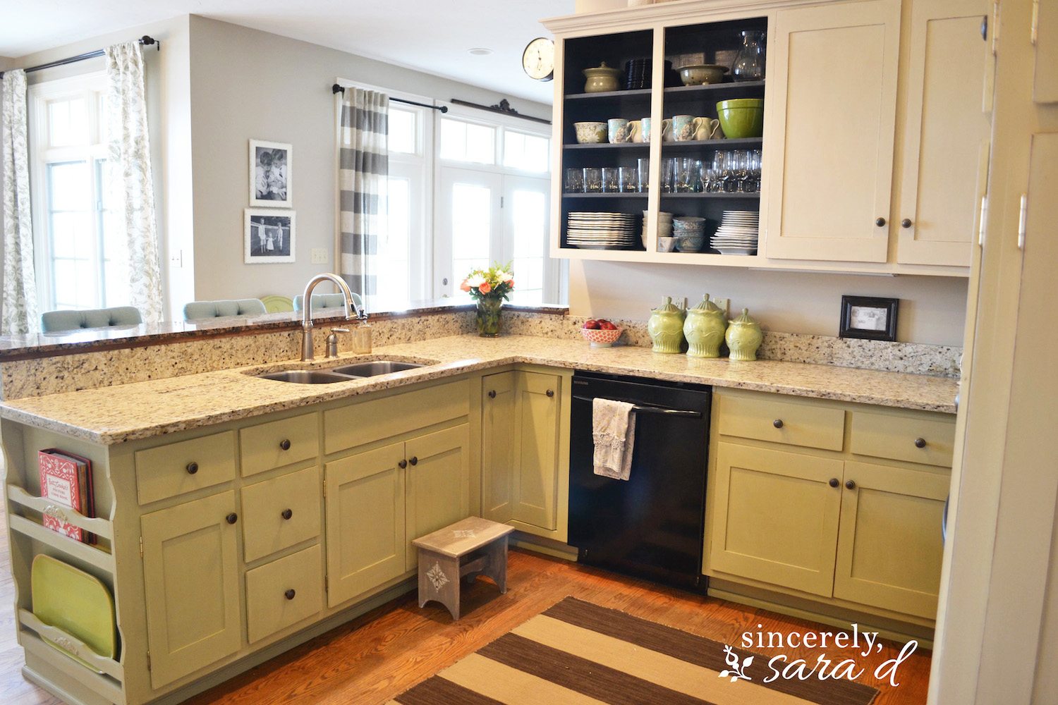
I painted my kitchen cabinets with chalk paint. Click HERE to see more.
Valspar’s Niagara Blue is so pretty, and it does make some appearances throughout my home – like on my kitchen pantry door and in the hall entry.
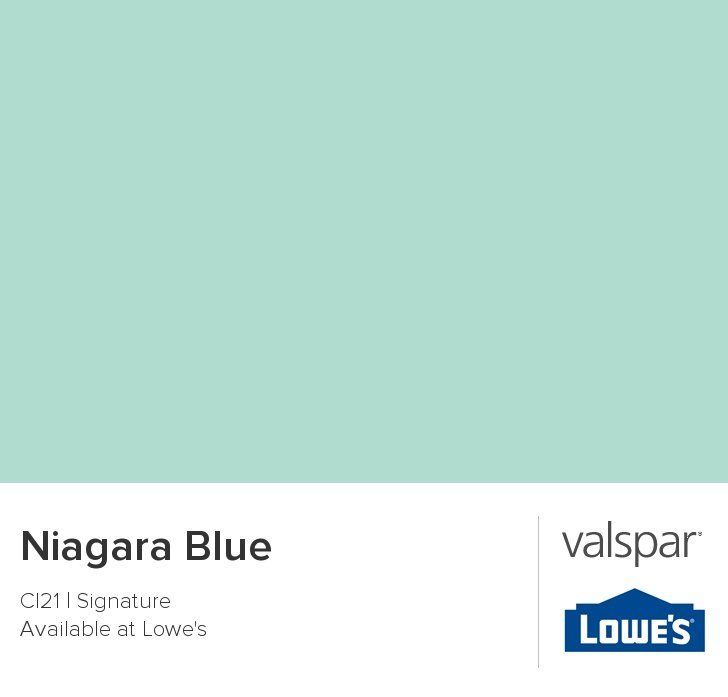

The Niagara Blue worked great on my pantry door, but it was a little too bright in my entry (there is much more light in the front of the house ). I mixed 1 part Niagara Blue with 1 part Cincinnatian Hotel Briggs Beige, and the result was the exact blue I wanted!
Painting really is the least expensive way to instantly change your home. Go have some fun with paint! If you hate it, you can always repaint! 🙂


Hi! I love the scheme of colors. I noticed the color of the trim and how it looks like a creamy white. Would you happen to know the color of the trim?
Tiffany, this is Sara’s house but I’m sure she’d be happy to give it to you (if she knows). You can email her at sara.davis@ymail.com.
Beautiful color choices and a beautiful home! Would you share where you purchased your dining room rug?? It’s perfect!
Hi Loren – thank you! I found the rug at rugsusa.com, but unfortunately I can’t find the link for it.
Great article! Thank for sharing. It is what I am looking for.
Your tips help me spend less time choosing every day! Thanks I will apply it to What Beats Rock !
Interesting choices using both beige and gray! The symmetry is a nice touch. Reminds me of navigating the color palette in a game like Slope – finding balance and avoiding pitfalls. Perhaps adding some accent walls in a bolder color could further define the spaces and add even more visual interest.
Choosing the right paint colors for your house palette involves considering lighting, room size, and the mood you want to create. Neutrals offer timeless appeal, while bold colors can add character and depth. For professional guidance and flawless results, check out https://www.chathampainters.net. A well-chosen palette can truly transform your space.
When we bought our house, the exterior paint was peeling badly, especially around the trim and porch posts. I went through https://five-star-painting.pissedconsumer.com/review.html and scheduled a consultation. They gave clear timelines and stuck to them. The team handled prep work carefully, which made a huge difference in the final look. Even the neighbors mentioned how sharp the house looked afterward. It’s been a few months and it’s holding up great — no flaking or fading yet. I’d use them again for interior work in the future.
Loved these paint color suggestions! It’s amazing how the right shade can completely transform a space. I’m definitely going to visit this page again when I start my next home project.
The office is fun and cheerful while the dining room is more sophisticated Watermark Remover and subdued
The article provides great insights into using neutral tones and creative color mixes to achieve a balanced and elegant home decor. The tips on combining beige and gray are especially useful! For more creative inspirations, check out wheelie party for amazing ideas!
The author discusses how different shades were used throughout their home, explains how colors like neutral beiges and grays balance warmth and light, and shares practical tips on combining hues to create visually pleasing interiors—helping readers understand how paint choices can affect the overall look and feel of rooms.
In a casual discussion about Windows streaming options, a local user mentioned Yacine TV Windows again, saying it had become his go-to choice for live sports nights because it just worked without constant updates.
Check out this guide my coworker followed for his recent clearance—super straightforward. He just clicked https://policeclearanceph.ph/ (wait, no—actually he went straight to the official NPCS site for registration and appointment). But seriously, the online process made it painless: account setup, slot booking, payment, quick station visit, done.
Keeping things neutral first is such a smart move those subtle tones like Briggs Beige and Woodlawn Colonial Gray make it easier to build a consistent look before experimenting with bolder accents. I’ve found that taking it slow like this helps avoid costly repaints, and even small breaks while deciding like checking cookie run kingdom codes April 2026 can make the whole process feel less overwhelming.